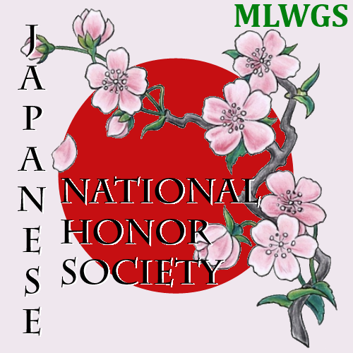


 NJHS Logo
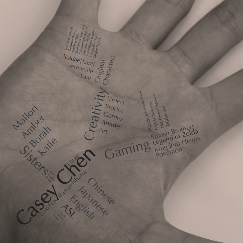
I'm the president of the Japanese National Honor Society this year. Being the Facebook newb, I either don't know how to change the picture beside a group to an actual picture rather than a compilation of group members, or I just don't know it wasn't possible. Totally screwed over my homework to work out this. The Sakura image is not mine, but it was found in the public domain via creative commons. I edited the picture to suit my needs.
Made in Paint.NET September 4,2013
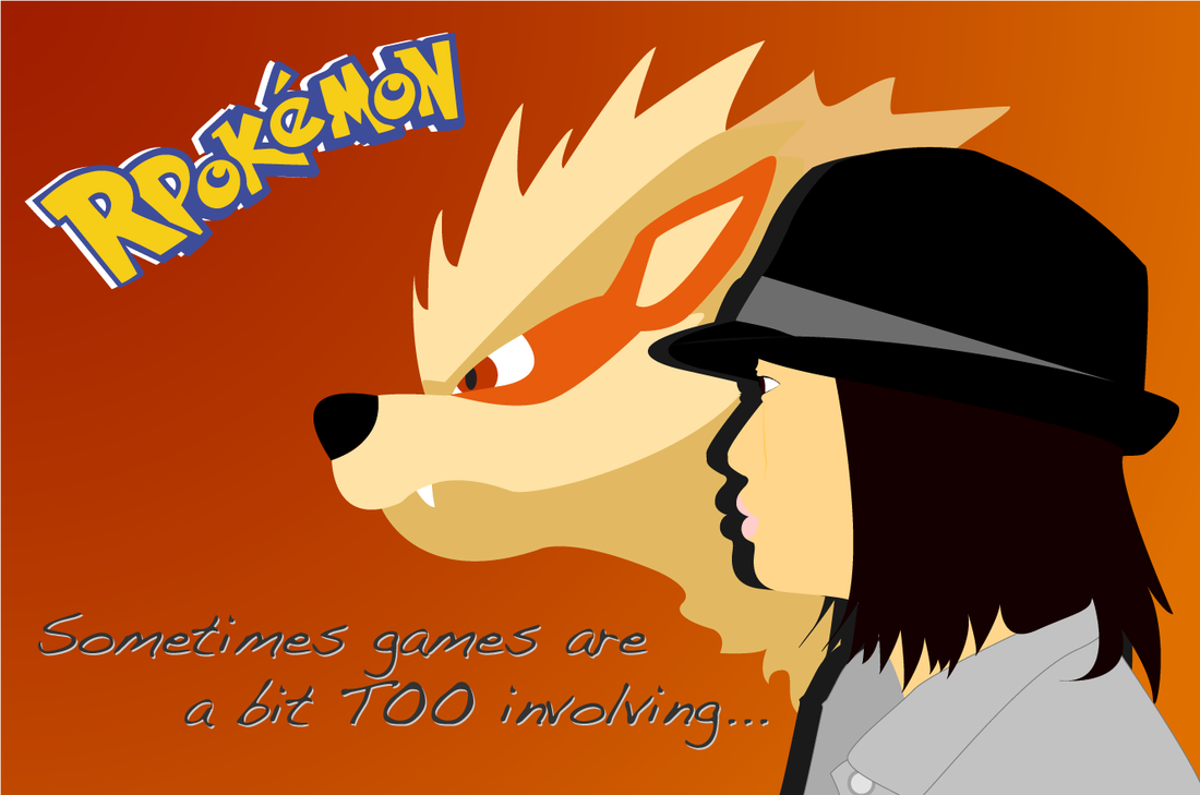
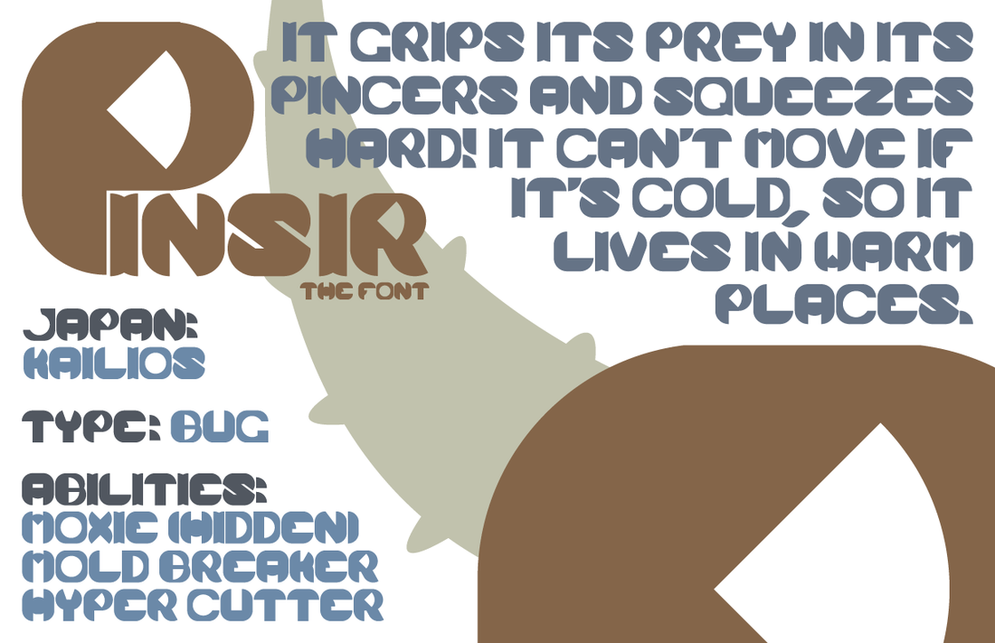
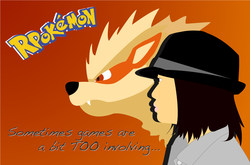 Art Inventory A - RPokemon
This is mainly based off my my Pokemon OC. She was created through an RP I was planning on doing with a friend, thus the R in Pokemon. I was going to put the actual character in there but it conflicted with the style and the angle of the head was different. Arcanine is a Pokemon special to her and it's also special to me. Arcanine is also based off a Chinese beast and I'm Chinese (technically Taiwanese). So yeah, that's about it.
Made with Adobe Illustrator September 16, 2013
Made with Adobe Illustrator September 16, 2013
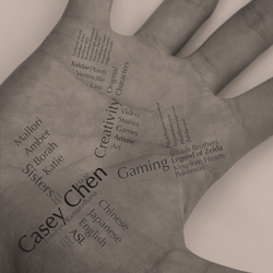
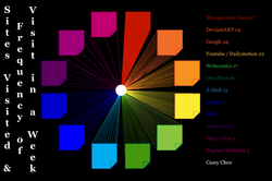 Art Inventory B - Infograph
Last year, Coach had us write down on post-its what we used the internet for last year. I also recorded the frequency of my visits to a site or a category of sites, so that's what these stats show. This is also why I referenced post-its. The white dot doesn't really mean anything, it was just to cover up some messy work with the origin of the lines.
Made with Adobe Illustrator September 18, 2013
Made with Adobe Illustrator September 18, 2013
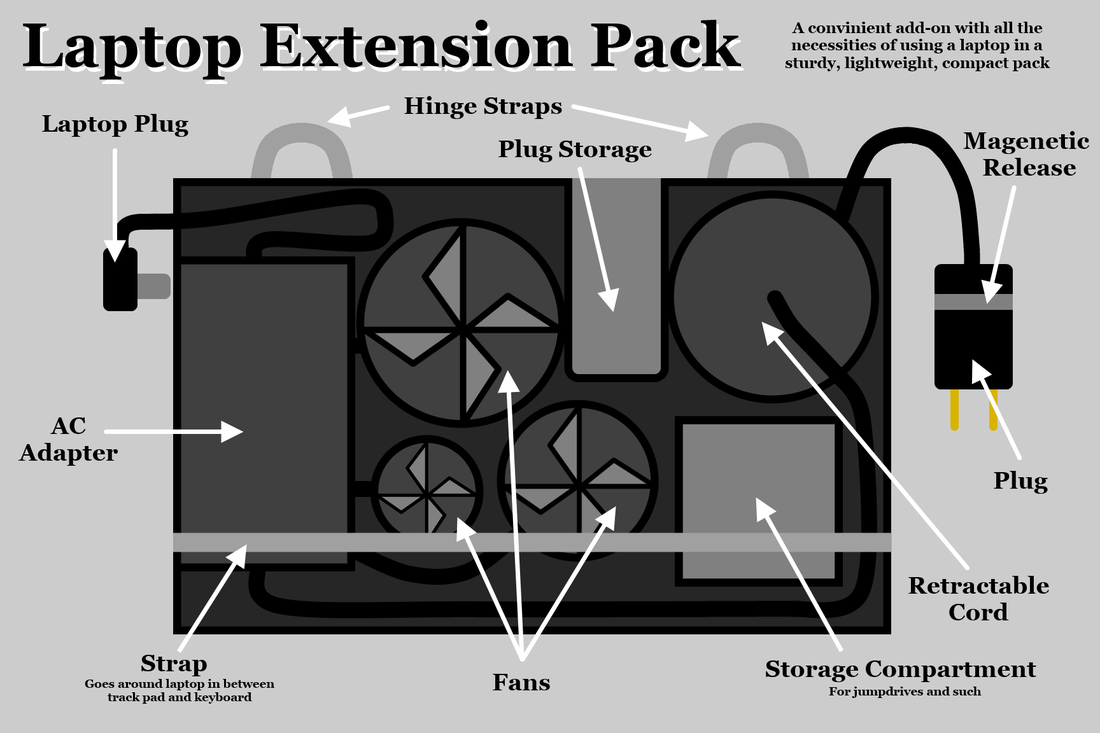
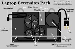 Art Inventory C - Laptop Extension Pack
It's not really addressing a problem I have, but it is kind of annoying when I realize I had forgotten my charger and my laptop is dying or dead. So this is a flat box that attaches to laptops and it contains the basic equipment for a laptop (charger, fan, flashdrives) so whenever you have your laptop, you have all the accessories that go with it.
Made with Paint.NET September 19, 2013
Made with Paint.NET September 19, 2013
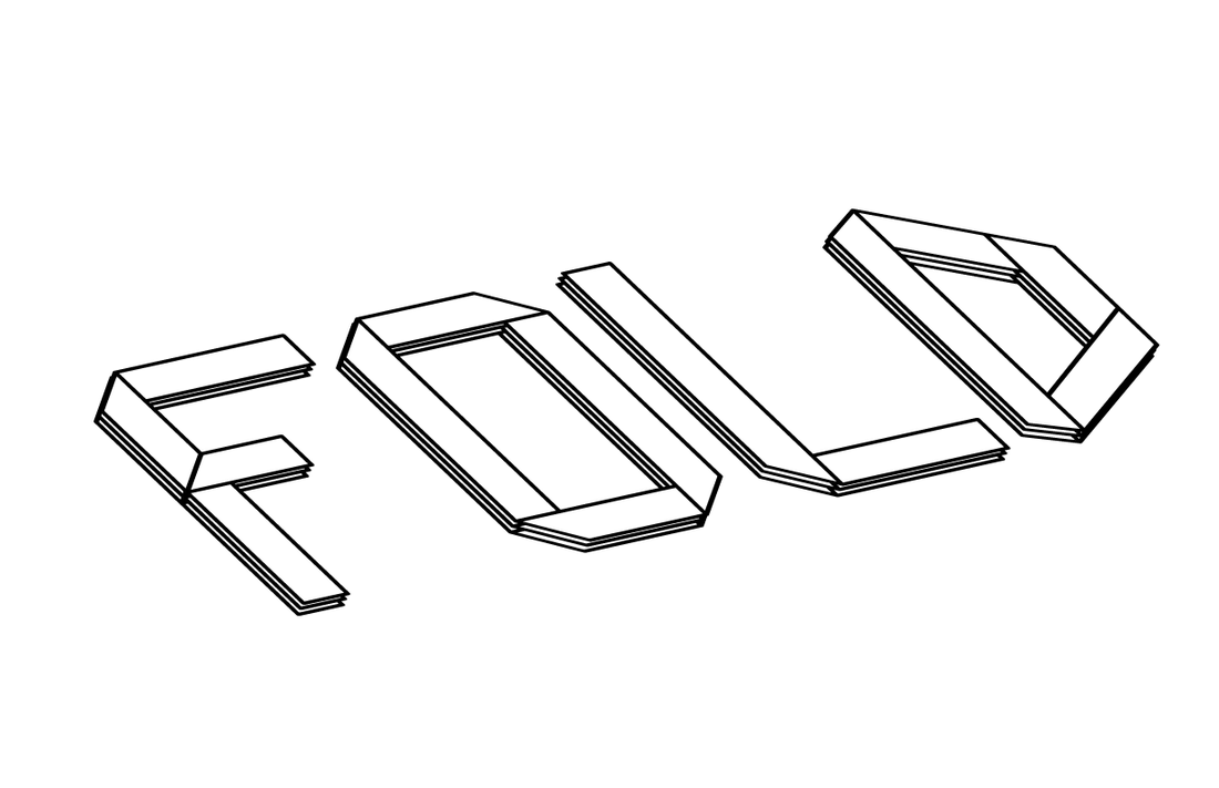
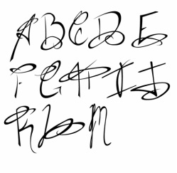
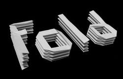 Typography (Physical) - Fold
I played around with the contrast and the brightness to solidify the background and make the letters stand out more. Had to use the clone tool too because the black paper I used for the background wasn't big enough for the angle I took it at. Made the mistake of taking this in black and white instead of editing it to black and white but it still worked out.
I learned to make the origami letters from Youtube user Jo Nakashima.
Photo Edited with Paint.NET October 9, 2013
I learned to make the origami letters from Youtube user Jo Nakashima.
Photo Edited with Paint.NET October 9, 2013
 Typography (Digital) - Fold
Snap to Grid and the 3D Effect are amazing tools. So I actually got this version out pretty quickly but people made suggestions to spread the layers out more, which I totally agree with. Problem is when I named the file, it actually saved it as a ".Casey" format, rather than .ai so it was hard to edit it again. I managed to figure it out later but by that point, I didn't have enough time to work out all the problems I wanted to. Aw well.
Made with Adobe Illustrator October 16, 2013
Made with Adobe Illustrator October 16, 2013
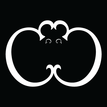
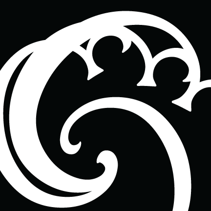
C Symmetry 1 - B&W
|
Initially this started out with just the two big Cs but whenever I looked at it, I always saw a bat so I added the eyes. In my opinion, it looks absolutely adorable. So one of the reasons I stuck with black and white is because color scares me. I suck at choosing colors.
Font: Harrington Made with Adobe Illustrator November 4, 2013 |
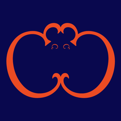
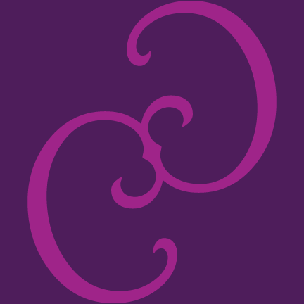
C Symmetry 1 - Color Test
|
C Symmetry 2 - B&W
|
I was initially going for a ripple effect. I can totally see it... but I also see an owl... I should have tried for an animal theme... aw well...
Font: Harrington Made with Adobe Illustrator November 4, 2013 |
C Symmetry 2 - Color Test
|
C Symmetry 3 - B&W
|
So the other reason I stuck with black and white is because this font and the designs I've made with it reminds me of those vintage wallpaper designs and I see them often in black and white. It just seems more fitting for my designs too because they're less detailed, making it look less floral, and black and white gives it sort of a modern taste.
Font: Harrington Made with Adobe Illustrator November 4, 2013 |
C Symmetry 3 - Color Test
|
C Asymmetry 1 - B&W
|
This is my favorite asymmetry one. I was going to try to pinwheel the letter in a complete circle, but the font wasn't very good with that So instead I reduced the size bit by bit and after a certain point, the pivoting point started to get a bit too crowded so I added the stand-alone C to balance it out.
Font: Harrington Made with Adobe Illustrator November 4, 2013 |

C Asymmetry 1 - Color Test
|

C Asymmetry 2 - B&W
|
Pretty simple concept here. Just flipped one of the Cs horizontally and vertically and just combined the two. It's really easy to see the original C here. I didn't rotate it or skew it at all. It would have been nice if it was a bit wider but Coach didn't really want us changing the proportions.
Font: Harrington Made with Adobe Illustrator November 4, 2013 |
C Asymmetry 2 - Color Test
|

C Asymmetry 3 - B&W
|
Originally this stood straight up where it looked almost symmetrical. That was the problem though, since this was supposed be asymmetrical. Personally, I liked the other version better but Coach did have a point when he told me to rotate it... It was really symmetrical for an asymmetrical design.
Font: Harrington Made with Adobe Illustrator November 6, 2013 |

C Asymmetry 3 - Color Test
|
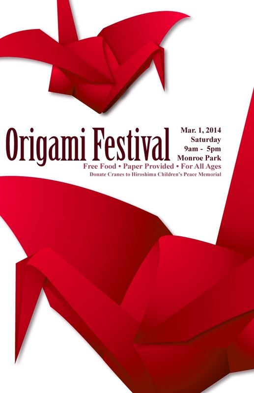
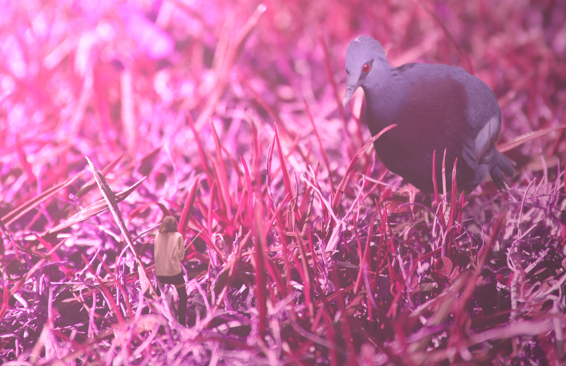
 Fiction Origami Poster Design
SCAD (Savannah College of Art and Design) recently had a contest called the SCAD Challenge where the winners will get a scholarship to for SCAD. This is my entry for the poster design, where we had to make an 11x17 poster for a an event, fictional or real. This is a fictional event.
The cranes were really fun to make. I had an origami crane I had already made and I placed it in front of me and created the crane from sight in Illustrator. Then I just applied gradients.
Fun Fact: The original design was blue. Then one of my friends suggested I change it to red to associate it with Asia more. I did that in Paint.net. There was also a subtle gradient background but Coach said it wasn't needed. Besides, I only liked the gradient when it was blue rather than pink. The original also had the time and place flushed left to line up with the l. Another one of Coach's suggestions changed that.
Made with Adobe Illustrator | Color Correction in Paint.net November 15, 2013
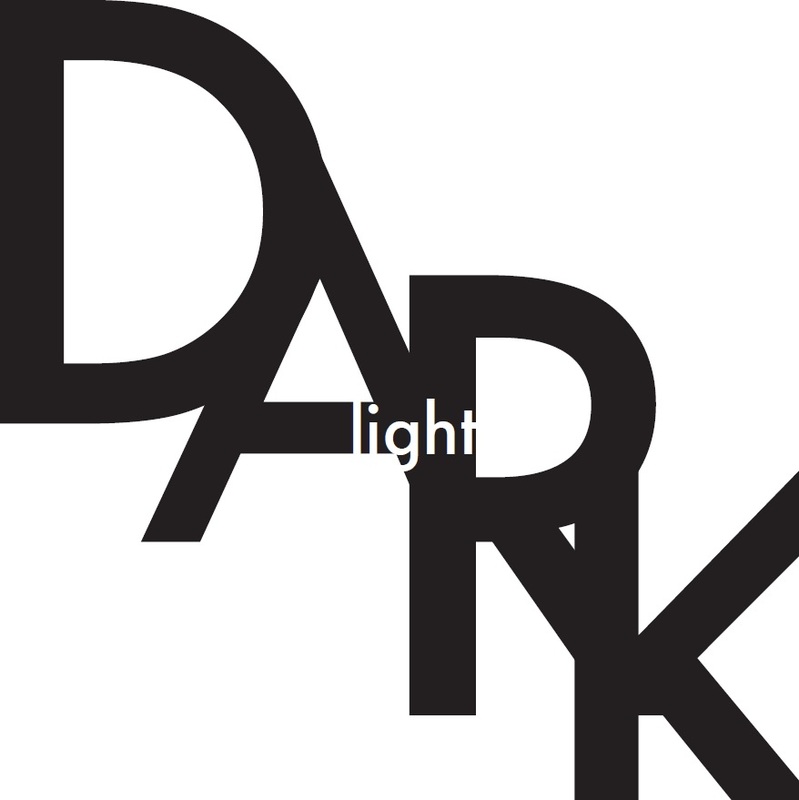
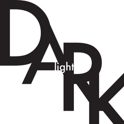 A Little Light in the Dark
This was a project focused on the use of scale. The square canvas was a bit of a problem since we weren't allowed to distort the dimensions of the type. I would have preferred to use a rectangular canvas so I could use the DARK to fill the space and create a better feeling of a dark room. There's a lot of white space that I wasn't entirely sure how to fill with the word. I'm also not too satisfied with how I cropped the DARK in order to condense it into the space, but it would have been more difficult to crop the D and keep it recognizable and balanced. I liked the idea though, considering some of my other ideas didn't utilize scale in the meaning.
Made with Adobe Illustrator December, 2013
Made with Adobe Illustrator December, 2013

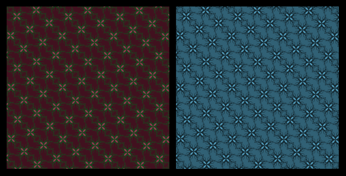
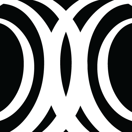
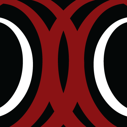
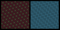 Color Project
It's cool how the one of the left emphasizes the "flower" and the one on the right emphasizes the "vines", even though both have the flower being the lightest colors. My pattern was screwed up for some reason. I went back and tried redoing it with the align tool but that still didn't work because some things I had to align by hand. Darn.
Made with Adobe Illustrator | Compiled in Paint.NET December, 2013
Made with Adobe Illustrator | Compiled in Paint.NET December, 2013
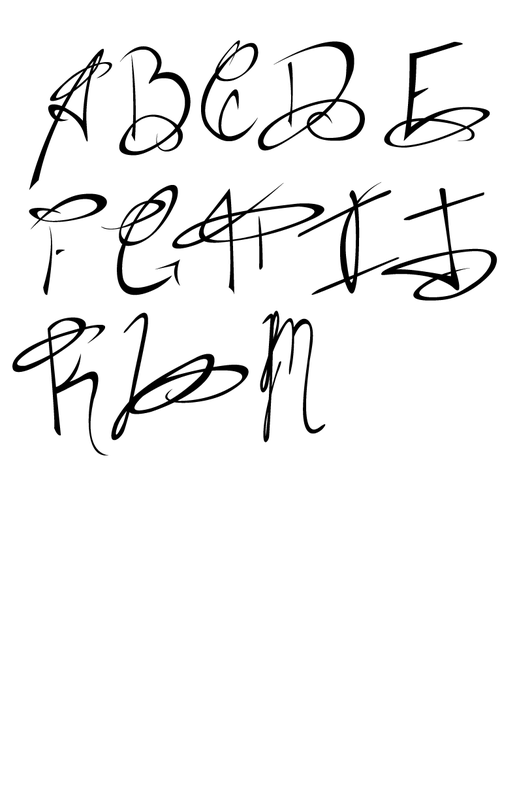
 Font WIP
This is an original font. I have all the capital letters planned out, just need to flesh it out in Illustrator, but man it's a painstaking task. This font is mainly used for titles or beginning of paragraphs. The first letter will be huge, and the rest of the text will be smaller. The vertical placement of the smaller text depends on the letter. Like for L, the smaller text will be placed above the mid-line, so above the loop. But for F, the smaller text will be lined up against the baseline. I should probably get working on the lowercase letters... Also might make a set of smaller, less fancy capital letters for sentences... but first thing's first, gotta finish this piece one day... Not sure of the name yet, but I'm gonna make up a name or pull one from an archive of made-up names I have.
Made with Adobe Illustrator March 6th, 2014
Made with Adobe Illustrator March 6th, 2014
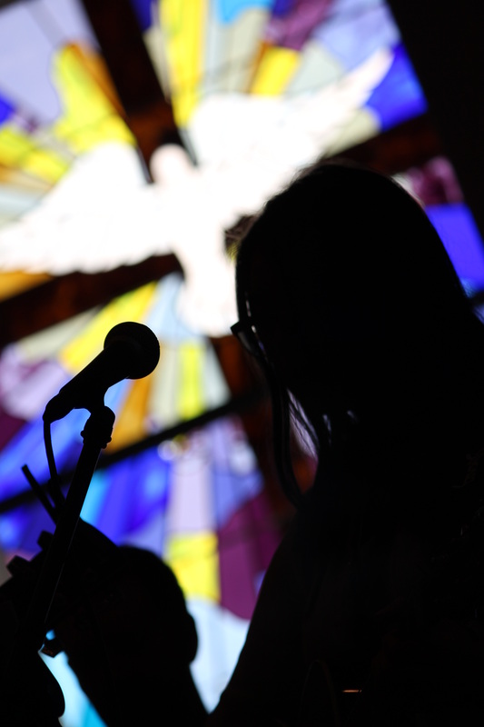
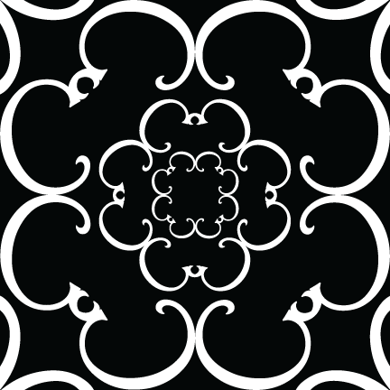
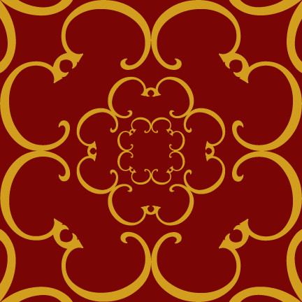
 Worship
 LokiFox Usage Sheet
 LokiFox Business Card
 LokiFox Envelope